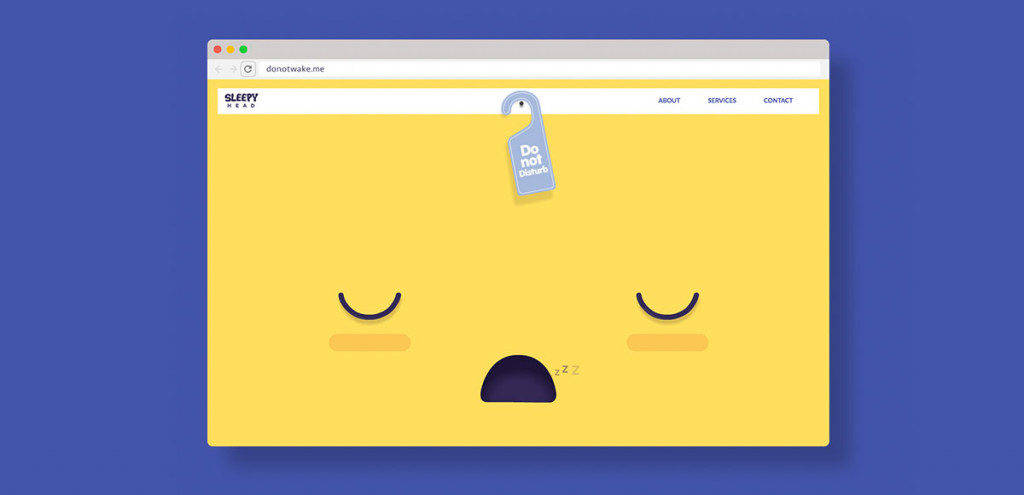
Animation is the rapid viewing of a series of images or positions of a model so as to create the illusion of motion. In fact, it is a visual ophthalmopath of motion and this is because the eye can retain an image for only 1/12 of a second!
Internet is a powerful medium that serves up both static and animated features, elements that shapeshift, travel and defy natural laws to the delight of audiences everywhere. Animations can actually improve users experience during their navigation in the website, so, it’s no surprise that web animation often attracts a user’s interest, providing marketers with a unique opportunity to promote products and services like never before.
There are a lot of web animations that can somebody see, scrolling down a website or searching the internet. The right type of web animation can encourage purchase, drive action, entertain, or deliver a more enjoyable user experience, as we said above. Choosing a specific style of movement helps define a creative direction, from sophisticated to dramatic or humorous. Subtle animated transitions, slide-in effects, fade out or gifs can be also designed to pique curiosity and encourage further exploration.
The purpose of web marketing is to attract the customer’s/visitor’s attention, to keep this attention in a smart and creative way, to impact attention and to lead to shopping or to another specific behavior. So, as you know, movement is a powerful means of completing all those objectives!
Well, let’s see some of the ways that movement can positively influence a person’s internet behavior:
Video
Video has always been one of the most effective tools of communication because they combine sound and image. The videos present visually, orally and at the same time musically any information that the business wants to pass to its customers and even easily, quickly and in a very impressively presented way. In addition, videos have a unique power to carve images into human memory and create a sense of immediacy with the recipient. They can used to tell a big or short story, to give advices, to inform about anything or to entertain people of the specific website that they are part of. So, as we understand, videos are a superb way to connect with audiences on an emotional level.
Shwood is an eyewear company that uses a video to show its products at its official website. This video is short but does a wonderful job of highlighting the product in context. You can enjoy the video here.
Sliding
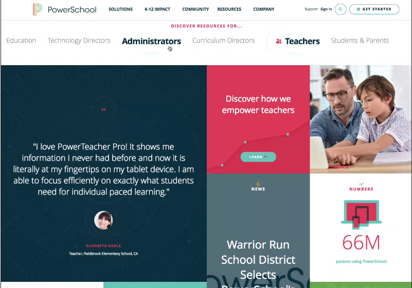
Sliding is a type of frictional motion between two surfaces in contact. In fact, is a carousel that rotates automatically, or one with arrows that encourages a user to interact via clicks, in an effective way to share multiple messages, information, bigger or smaller pieces of a larger story. We found an example of a wonderful sliding in the interactive PowerSchool website. Looking at the website, you’ll notice additional movement within the carousel slides that incorporates design elements that fade into view and slide both vertically and horizontally in a very impressive way. Users can navigate the website easily & quickly and discover any information they simply ask with a click of a button. Also, the sliding makes the navigation entertaining, enthusiastic and useful, which enables a user to interact with the website seamlessly and allows web designers to create a more personalized experience based on the user group selected.
Drag and Drop
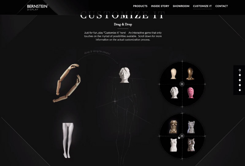
In computer graphical user interfaces, drag and drop is a pointing device gesture in which the user selects a virtual object by “grabbing” it and “dragging” it to a different location or onto another virtual object. In general, it can be used to invoke many kinds of actions, or create various types of associations between two abstract objects. Bernstein Display is one business that makes particularly creative use of this. On their website, users can drag and drop a variety of mannequin parts such as arms, legs, torso and heads to create unexpected combinations of people. In this way, users can interact deeply with an array of products and learn about the distinct types of customizations that are available.
Transitions
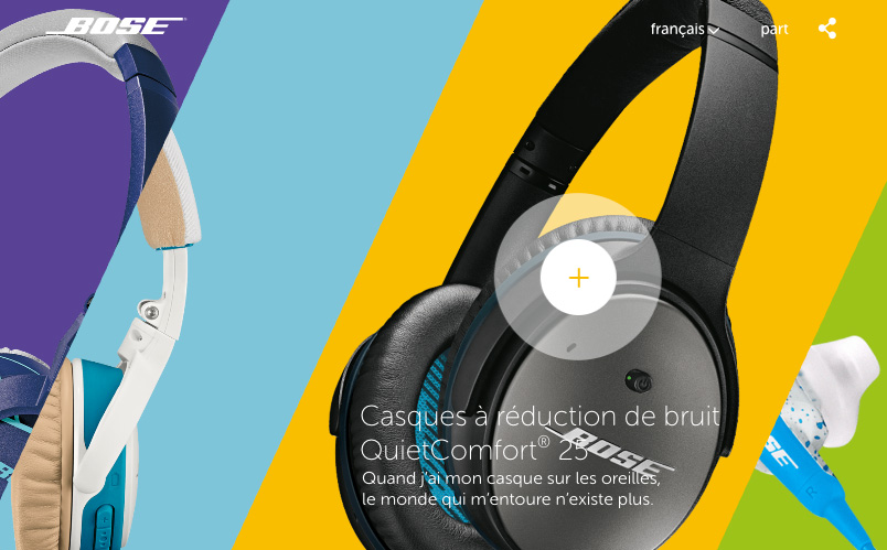
Another new trend that can improve user’s web experience by providing context and visual continuity at them, are web page transitions. These transitions can reinforce branding and heighten engagement and are very effective with the audience’s navigation at the website. An example is the French Bose website that uses transitions so as to present its products, which are headphones. Just hover over a box on the home page and the headphones come forward. Click on the product, and a box opens to further immerse yourself into product details and the brand itself.
Web Animation
The web animation is quite compelling, and is used to draw an audience in and dramatically increase online engagement. HTML5 and CSS3, can be used to code all sorts of customized movement from scratch. The top of the Bernstein Display website features a highly custom introduction to the brand, services and rich heritage.
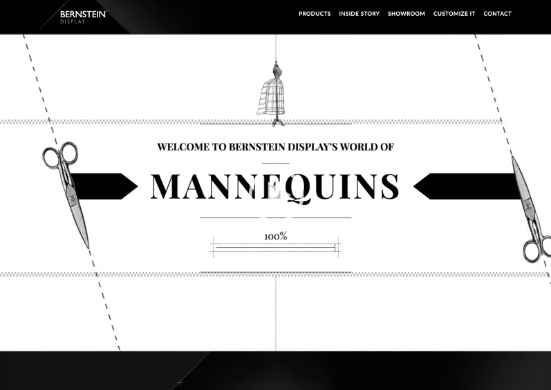
Subtle web animation can make your brand interesting, give character to your company and draws attention to what your brand offers.
Blending web animation with compelling visual design allows a website to personalize experiences for vastly diverse types of consumers. Beyond that, movement can help drive important behaviors like engagement and conversion.
Another site that uses HTML5 and CSS3 is Drybar. Its entire website is filled with tiny, gratifying animations that are funny, useful and interactive. When you move your mouse over the little hairdryer, it bounces. Hover over the icons in the navigation, and each respond with a small visual wink!
So… Do you want to think again about these new trends?! As you saw, they can improve the user experience and contribute to the success of business objectives and marketing goals!
